
Market Breadth: The Indicator Most Investors Check Last
Seven Companies Are Driving the Market. Is That a Problem?

Seven companies. Five hundred and three stocks. One index at an all-time high.
In 2025, the S&P 500 hit a record. At the same moment, the median stock in that same index sat 19% below its own all-time high. Which number tells you the truth about the market?
The answer depends on what you are actually trying to measure. If you own an S&P 500 ETF, the index level is what matters. But if you are trying to understand whether the market’s gains are broad, durable, and structurally sound, the index level is close to useless. It tells you what seven companies are doing. It says almost nothing about the other 496.
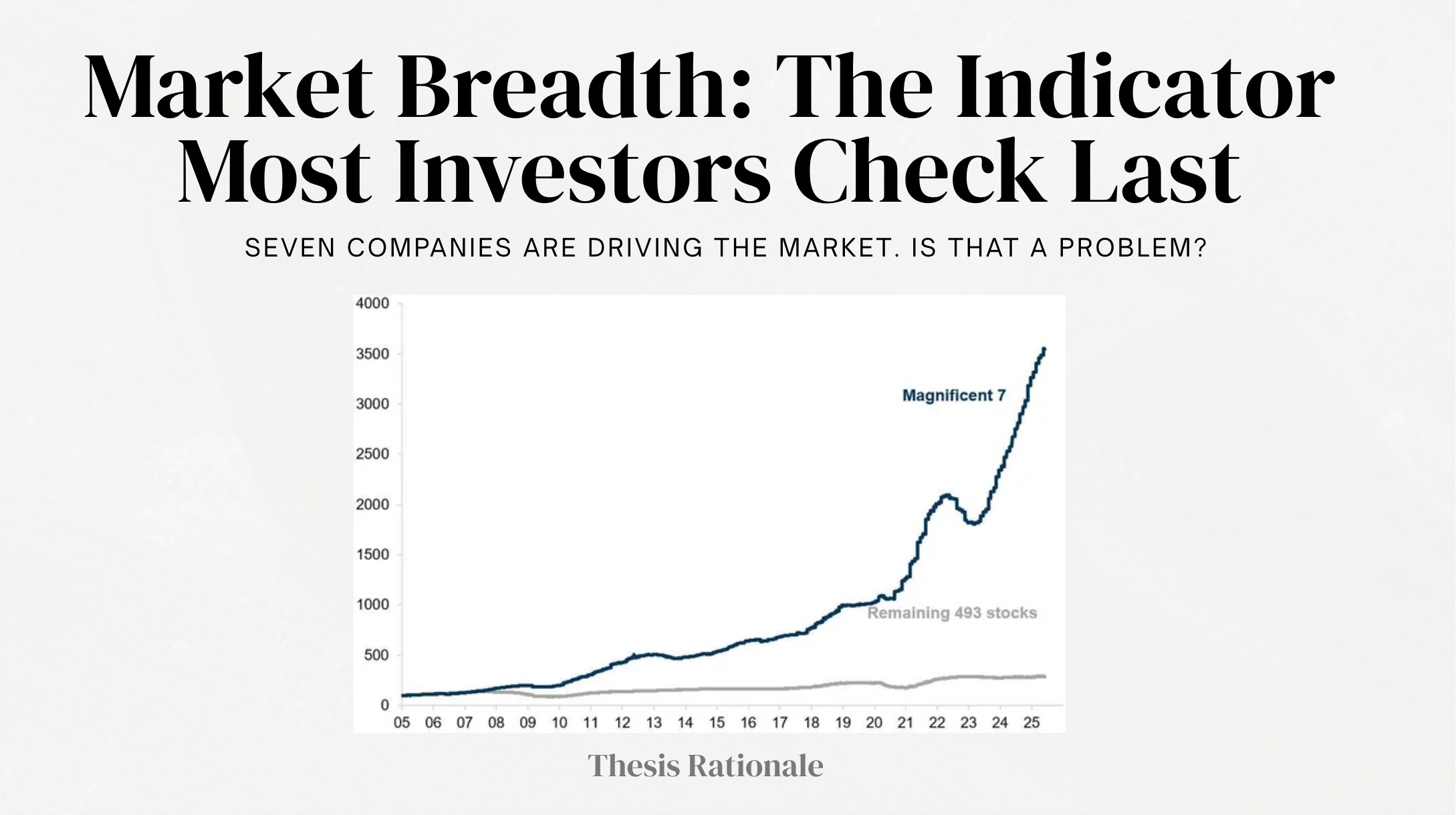
As of May 2026, the Magnificent Seven, Apple, Microsoft, Nvidia, Amazon, Alphabet, Meta, and Tesla, account for 30.4% of the entire S&P 500 by market capitalization. Seven companies. Thirty percent of the index. The S&P 500 has 503 constituents. Its Effective N, the number of truly independent positions the index actually behaves like, is 54. Not 503. Fifty-four.
The question worth asking is not whether these seven companies are good businesses. Most of them are. The question is whether an index that behaves like 54 equally-weighted stocks, dominated by a handful of AI-adjacent names, is giving investors the diversification and structural resilience they believe they are buying. In Q4 2023, the Magnificent Seven accounted for 225% of the S&P 500’s total earnings growth. The remaining 493 companies contracted in aggregate. The index looked healthy. Most of the market was not.
This is what market breadth measures. And right now, it is telling a more complicated story than the headline number suggests.
If you haven’t explored our previous research, you may revisit some of our earlier due diligence reports and thematic notes below. Each piece reflects the same thesis-driven framework we apply across every investment case.


The Number That Hides Inside the Index
The S&P 500 is a market-capitalization-weighted index. When Apple, Microsoft, and Nvidia go up, the index goes up, regardless of what the other 496 stocks are doing. This mechanical fact produces a specific and recurring distortion: index gains can look broad and healthy while the majority of the underlying companies are treading water or declining.
In 2023, the S&P 500 returned 26%. The equal-weighted version of the same index, where every company counts equally, returned approximately 12%. The 14-point gap was not noise. It was the entire story of that market in a single comparison. Seven companies, the group now known as the Magnificent Seven, were responsible for the difference. In June 2023, only 1% of S&P 500 stocks, representing just five companies, outperformed the median Magnificent Seven return on a rolling six-month basis.
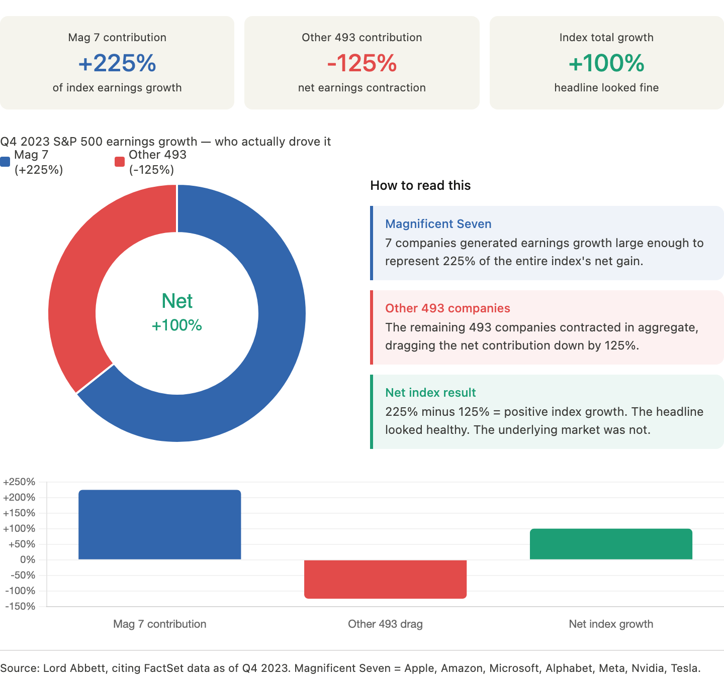
In the fourth quarter of 2023, the Magnificent Seven accounted for 225% of the overall earnings growth of the S&P 500. That figure requires a moment to absorb. The seven largest companies in the index were growing earnings so fast that they offset net earnings contraction across the remaining 493 companies and still produced positive index-level growth. The index was healthy. The market was not.
Market breadth is the set of tools that measures this gap.
What Market Breadth Actually Measures
Market breadth describes the degree of participation in a market move. When an index rises and most of its components are rising with it, breadth is wide. When an index rises but only a handful of companies are carrying it, breadth is narrow. The distinction matters because narrow breadth markets are structurally more fragile than broad breadth markets.
Three indicators do most of the analytical work.
Advance-Decline Line (A/D Line)
The A/D line is the cumulative daily count of advancing stocks minus declining stocks. Each trading day, you add the net number of advancers to the running total. A rising A/D line alongside a rising index confirms the move. A falling A/D line alongside a rising index is a divergence, and historically one of the most reliable warning signals in market analysis.
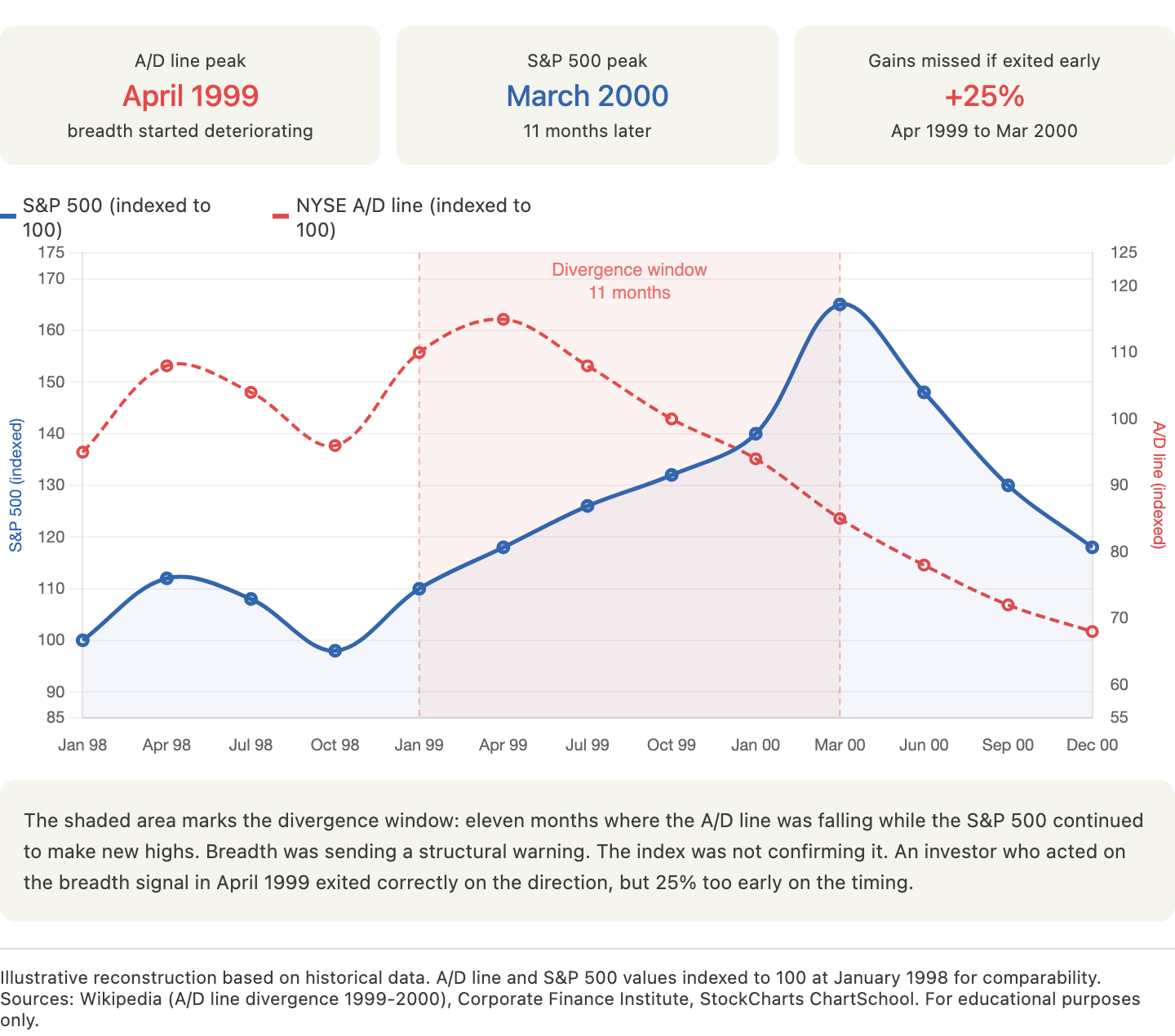
A practical example: in the months before the dot-com peak in March 2000, the S&P 500 continued to make new highs while the NYSE A/D line had already peaked and begun declining. The index was being carried by a shrinking number of technology names while the broader market had already turned. The divergence was visible in real time for anyone looking at breadth rather than index levels alone.
Percentage of Stocks Above Their 200-Day Moving Average
The 200-day moving average is the standard institutional dividing line between a stock in a long-term uptrend and a stock in a long-term downtrend. The percentage of S&P 500 components trading above their own 200-day moving average is a direct measure of how many companies are in structural uptrends.
The thresholds that matter:
Above 70%: broad market participation, generally constructive
40% to 70%: mixed conditions, increasing selectivity required
Below 40%: structural deterioration, the index level is likely misleading
Below 20%: capitulation territory, historically associated with durable market lows
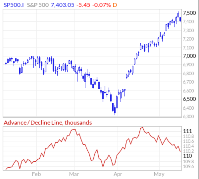
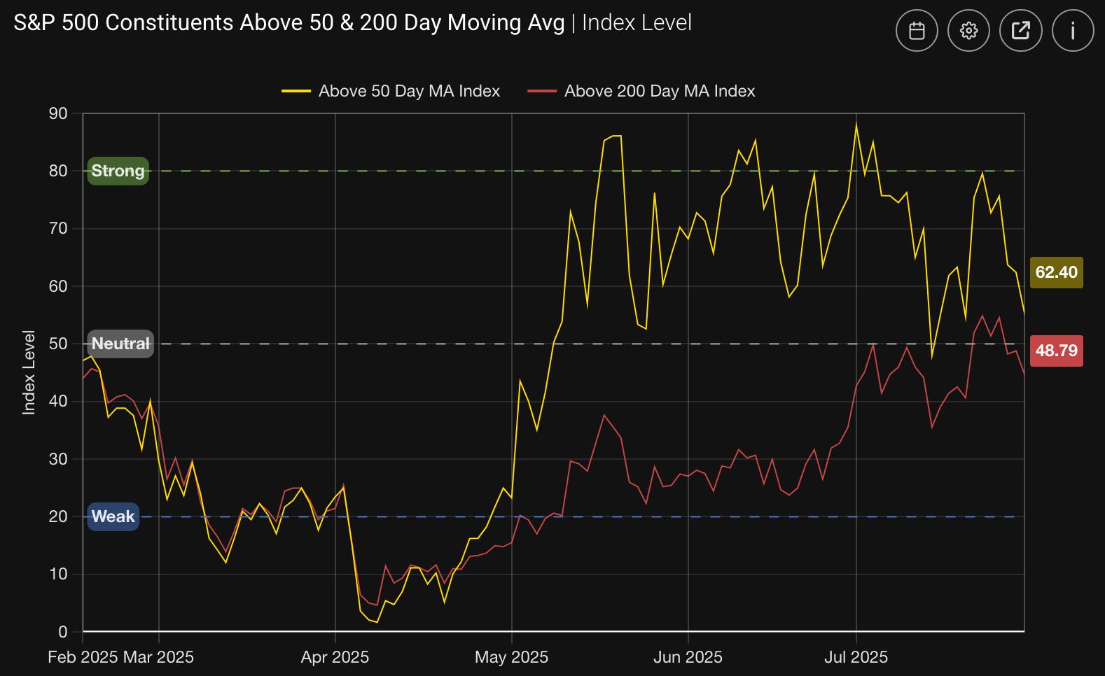
After the White House announced proposed tariffs on April 2, 2025, the percentage of stocks trading above their 200-day moving average dropped to 16%, before climbing back to 64% by the end of the following month. That swing from 16% to 64% in under 60 days is one of the fastest breadth recoveries on record, and it preceded the S&P 500’s 36% rally from its April 8 low.
New 52-Week Highs vs. New 52-Week Lows
This indicator tracks the daily count of stocks hitting new annual highs versus new annual lows. A healthy bull market produces an expanding population of new highs. When indexes are rising but new highs are declining, or when new lows are expanding alongside a flat or rising index, the market’s leadership is deteriorating even if the headline number looks fine.
As of September 2025, both the S&P 500 and Nasdaq were trading at all-time highs, but the share of stocks within those indexes hitting new 52-week highs was 4.6% for the S&P 500 and 3.5% for the Nasdaq. Compare that to late 2024 when indexes were rising alongside an expanding population of new highs. The September 2025 reading was a textbook narrow-breadth signal: record index levels sustained by a shrinking group of leaders.
The 2023-2025 Case Study: What Narrow Breadth Looks Like in Practice
The period from mid-2023 through late 2024 is the cleanest recent example of how narrow breadth distorts the investment environment, and what eventually happens when it resolves.
Phase 1: Extreme Concentration (Mid-2023)
By June 2023, the Magnificent Seven dominated S&P 500 performance to a degree not seen since the late 1990s technology concentration. The Magnificent Seven account for 34.8% of the S&P 500 as of May 12, 2026, a significant increase from 2016 when they made up 12.5% of the index.
As of April 2026, the S&P 500’s Herfindahl-Hirschman Index, the standard measure of market concentration, stood at 185 against a five-year average of 142, and the index’s effective number of independent positions was just 54 stocks despite having 503 holdings. In practical terms, the S&P 500 was behaving like a portfolio of 54 equally-weighted companies, not 503.
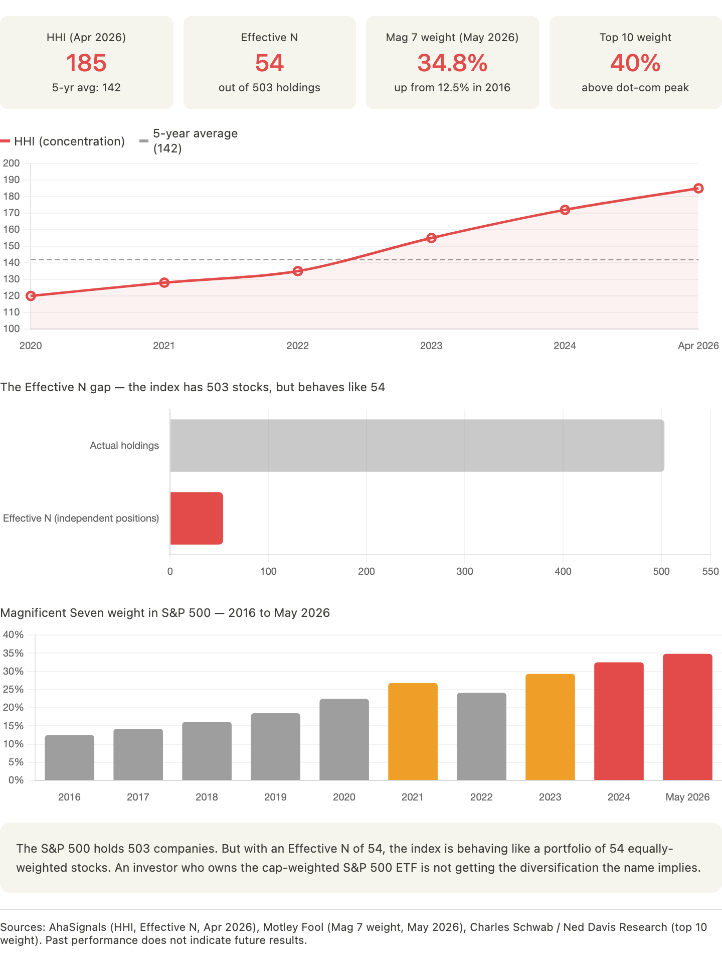
For passive index investors, this was essentially irrelevant. The index went up, the ETF went up, the statement looked good. For active investors and for anyone trying to understand the structural health of the market, it was a significant distortion.
Phase 2: The Consequences of Concentration
Narrow breadth creates a specific tail risk: when the few companies carrying the index face any fundamental challenge, the index drawdown is disproportionate to what the underlying fundamental deterioration would suggest, because the companies involved carry more index weight than their fundamental contribution would justify at normal valuations.
The week of April 21, 2025, Morgan Stanley’s equity-finance desk reported that 60% of every gross dollar sold by hedge funds worldwide over those five days was in Magnificent Seven stocks, despite the group representing nowhere near 60% of total gross exposure. When concentrated positions unwind, they unwind fast, because everyone who loaded up for the same reasons unloads for the same reasons at the same time.
Phase 3: Breadth Recovery and What It Signals
On a rolling six-month basis through June 30, 2025, the percentage of stocks outperforming the Magnificent Seven median reached 51%, representing 251 securities, up from just 1% in June 2023. This recovery in breadth, from historic concentration to something approaching normal participation, is a constructive structural signal. It means the earnings cycle is broadening, that companies outside the mega-cap technology group are generating enough fundamental improvement to attract capital, and that the index’s future performance is less dependent on whether seven specific companies keep growing at extraordinary rates.
In 2025, the S&P 500 gained 14%, but excluding the Magnificent Seven, the remaining 493 stocks returned just 8%. The median stock in the S&P 500 remained 19% below its all-time high while the index was at an all-time high. The breadth recovery had begun, but it was not yet complete.
What Breadth Does Not Tell You
Market breadth is frequently misused as a market timing tool, and this misuse produces poor results. Three clarifications on what breadth indicators do and do not do.
Narrow breadth does not predict a crash. The A/D line can diverge from index highs for months or even years before a correction. In 1999, the NYSE A/D line peaked in April, a full eleven months before the S&P 500 peaked in March 2000. An investor who exited equities on the A/D divergence signal missed 25% of gains before the correction arrived. Breadth divergences are risk signals, not timing signals.
Wide breadth does not guarantee continued gains. A broad, healthy market can still correct on valuation, macro shock, or earnings disappointment. Breadth describes participation, not valuation. October 1987 had relatively healthy breadth before the crash.
The relevant question breadth answers: Is this market’s strength structural and broad, or is it concentrated and therefore fragile? Structural breadth environments reward long-term equity exposure. Concentrated breadth environments reward selectivity and demand a more careful look at what is actually in the portfolio versus what the index level suggests.
How to Use Breadth in a Long-Term Portfolio Framework
For long-term investors, breadth is most useful as a risk calibration tool rather than a trading signal. The practical applications are straightforward.
When breadth is wide and recovering:
Broad equity exposure becomes more reliable; the rising tide is actually lifting most boats
The Engine and Chassis tiers of a structured portfolio can carry more weight with higher confidence
Individual stock selection matters less, because the macro environment is supportive across a wider range of companies
When breadth is narrow and deteriorating:
Index level performance is increasingly unreliable as a proxy for portfolio performance
Selectivity becomes the primary driver of returns; owning the right companies matters far more than owning equities generally
The Tire and Spare Tire tiers of a structured portfolio provide increasing structural value, not because a correction is imminent, but because the risk distribution across the market has become more asymmetric
When breadth is at extremes:
At the lows, below 20% of stocks above their 200-day moving average, the market is pricing capitulation. Historically, these readings have preceded some of the strongest forward returns available in equity markets. They are not comfortable moments to deploy capital, which is precisely why they tend to be rewarding ones.
At the highs, when fewer than 5% of stocks are making new 52-week highs while the index is at records, the narrowing of leadership is a warning that the index’s performance has become increasingly dependent on a small number of names sustaining extraordinary valuations. Historically, extreme concentration has occurred only 16% of the time since 1990. In the 12 months following such periods, the equal-weight S&P 500 outperformed the market-cap-weighted index 43% of the time, with average excess returns of 3.1%.
The Current Breadth Environment
As of mid-2026, the breadth picture is mixed and improving. The April 2025 tariff shock produced one of the sharpest breadth collapses in recent history, but the subsequent recovery has been equally sharp. The percentage of stocks above their 200-day moving average recovered from 16% to 64% within roughly 60 days of the April low.
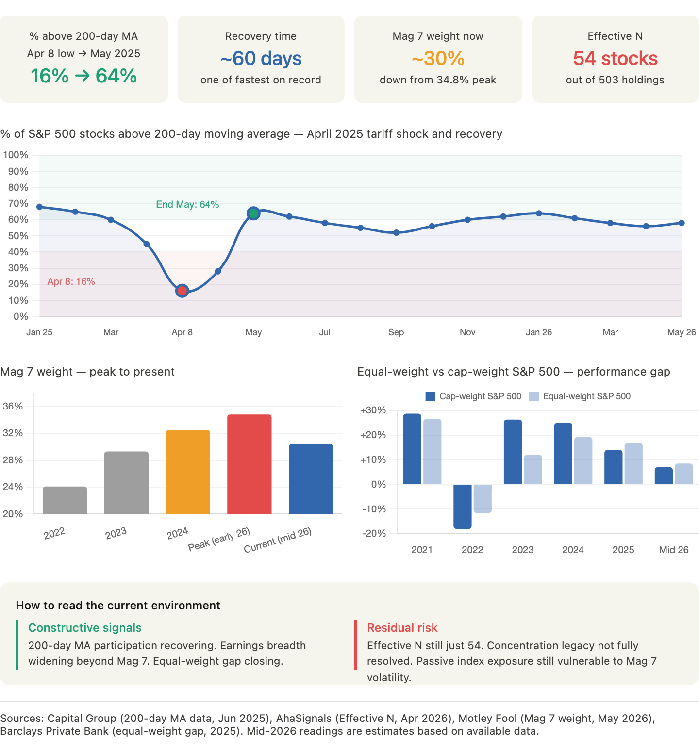
The Magnificent Seven’s weight in the S&P 500 has lessened somewhat from its peak, and the broadening of earnings growth beyond the mega-cap technology group is continuing. The equal-weight index has begun to close some of its performance gap against the cap-weighted index. These are constructive structural signals.
The residual risk is concentration. Seven companies still represent approximately 30% of the S&P 500, and the index still behaves like a portfolio of roughly 54 equally-weighted stocks despite having more than 500 constituents. The breadth recovery is real but the concentration legacy has not fully resolved. For investors running actively managed portfolios, the most important implication of the current environment is that returns are becoming more broadly available, but the structural fragility that comes from extreme concentration has not fully unwound.
In practical terms: the environment rewards selectivity, favors quality businesses with durable earnings over speculative positions, and continues to penalize passive exposure to the cap-weighted index in proportion to whatever the top seven companies decide to do next quarter.
Summary: Three Things to Remember
First: Index performance and market performance are frequently different things. Check the equal-weight version of any index you are evaluating before drawing conclusions about the health of the underlying market.
Second: The three breadth indicators that matter most are the Advance-Decline line (direction and divergence), the percentage of stocks above their 200-day moving average (structural trend participation), and the new highs versus new lows ratio (leadership quality). Together they describe the market’s internal structure in ways the index level cannot.
Third: Breadth is a risk calibration tool. Wide breadth lowers the structural risk of broad equity exposure. Narrow breadth raises it, and shifts the premium toward selectivity and quality. The investors who understand this distinction build portfolios that perform through cycles rather than in spite of them.
This article is part of the Thesis Library series. All Thesis Library content is free to access. For portfolio-specific analysis of how the current breadth environment affects individual positions, see Thesis Weekly, available to Thesis Insider subscribers.
Disclaimer: This article is provided for informational and educational purposes only. It does not constitute financial or investment advice. Investors should conduct their own due diligence or consult a licensed advisor before making any investment decisions.